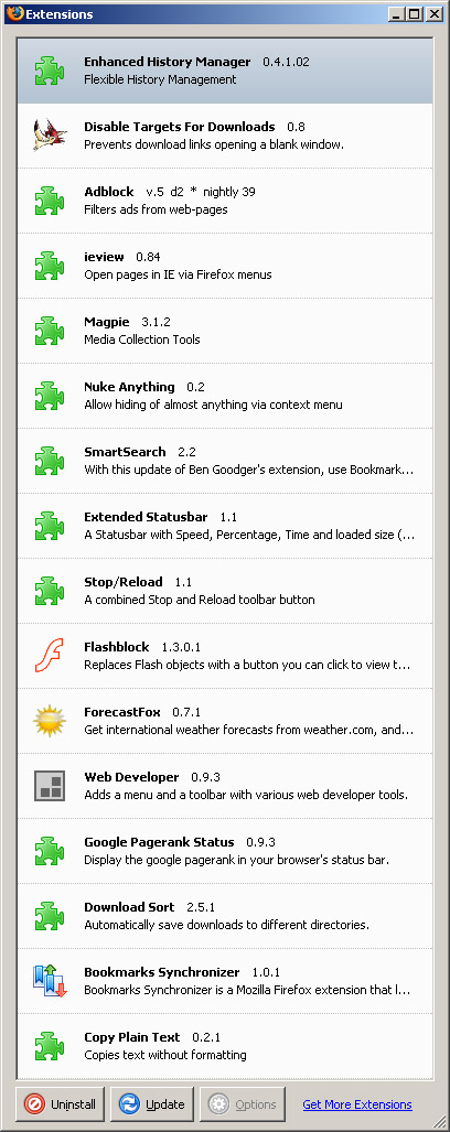
Of course, if you’re a savvy Internet user, you’re already amongst the 44-some million users of FireFox. Pop-up blocking and tabs are so last year. There’s a world of very useful Extensions that make browsing that much nicer.

Did I Forget To Mention?
So today I wake up at the crack of dawn to the sweet mellifluous ballad of 5 huge Mac trucks under my open window whose drivers get no greater satisfaction from life than slamming their cargo doors up and down, racing around the loading dock in reverse (“BEEP, BEEP, BEEP!”) and establishing the alpha male through engine revving. Only the most X-Treme men of the world man these rigs, reminding the hapless bleary-eyed college students quietly dozing on the floors above of their insignificance in the most awesome quest of foodstuffs delivery.
Squinting into the bright light and fumbling the window closed, I wake up enough only to realize that I won’t fall asleep again this morning.
9:20 AM. Damn, the air got stuffy in here. Slowly I realize I have a written German test in 40 minutes. Sweet! I do reasonably well on it, nice given the lousy morning. Then there’s a quite challenging OS Scripting Midterm at noon whose ass receieves a fair amount of kicking. But this day has more fun in store for me, so I get to wrap things up all nice and shiny with a quite difficult Data Analysis quiz who kicked my ass. Phew, its over. I get back to floor, only to realize that I just missed the Social Computing meeting I’ve been reminding myself to go to for a few weeks now. I didn’t get tax forms I’ve been expecting in the mail so the Feds will be after me come Friday.
Did I forget to mention Monday is the worst day of the week?
Ah well. I made up for it a little bit by browsing around for CSS hacks. See them in action at the spicy examples!
Tomorrow should be better; I’m getting tests back instead.
The user interface is the one thing you are going to see more of than anything else on your computer. Fortunately plenty of software titles allow you to switch between different themes.
Good news if you use XP. Microsoft’s theming engine is not limited to the lame “Luna” themes introduced with XP. You can get the benefit of using Windows’ internal theming engine without actually paying a dime.
NOTE: This hack has worked for me through many Windows installs, but if you screw up your computer, I claim no responsibility.
The theme format for Windows XP has been very successfully reverse engineered. The three versions of Luna are all this format, and the themes for StyleXP also are in this format. Microsoft tried to limit the engine to only Microsoft themes, but we can patch the file that checks that.
Here’s what we’re going to do:
Hooray, StyleXP for free. Just move additional themes into the Themes folder to make them accessible through the Display control panel.
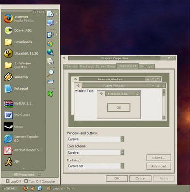
P.S. Oh, and if you need to justify using themes to yourself beyond their cometic appeal, know that some themes like Cursive (below) can be functionally better. Thinner scrollbars, thinner titlebars, and a collapsed start menu translate to greater screen real-estate. As software gets more and more palette heavy, that can be quite handy.
“Crusin Down The Street In My 64”
Go see “Dynamite Hack – Boys in the Hood.” The video.
Prepped out golfers livin it badder than Easy E? Definitely choice.

…if you have RealPlayer
(just download it instead, streaming is lame.)
It’s always highly interesting to me to see what the big tech companies that have “made it” do to get where they are. Sometimes its surprising how the little changes make huge differences. Google is full of examples just like any other company:
One of the biggest leap in search usage came about when they introduced their much improved spell checker giving birth to the “Did you mean…” feature. This instantly doubled their traffic, but they had some interesting discussions on how best to place that information, as most people simply tuned that out. But they discovered the placement at the bottom of the results was the most effective area.
Marissa Meyer, Product Manager for Google
Another interesting presentation is about Amazon.com. Amazon is supposedly one of the best sites for usability out there. It’s in their financial interest to be easy to use, because when ecommerce was new, it needed to be friendly and predictable to its users to succeed. Amazon is a “new” way to buy things and breaking the ice with new Internet users was a tricky chore for them. Check out the pages about 1/2 way through about the site redesign options, pretty interesting usability research.
P.S. First picture post! This is me at The Gates last February.

