Categories
Design General Handy Interface Technical

Make SkyDrive.app a true background app in one step

The goods:

defaults write /Applications/SkyDrive.app/Contents/Info LSUIElement 1

What a busy week it’s been in the cloud file hosting world.

I don’t like ‘set and forget’ apps cluttering up my Dock/app switcher. So since that’s exactly what the SkyDrive preview is doing on my Mac, that little one liner is how to fix it.

(Assuming you’ve already downloaded and installed the SkyDrive.app preview into /Applications/, pop open a Terminal and hook up that one-liner. Tested on Lion 10.7.3. Bonus hack: The Info.plist file also is where the minimum OS requirement is stored. i.e. you might be able to get SkyDrive.app to work on <10.7 if you poke around in that file, but whatever consequences that has are definitely on you.)
Change your mind?

defaults write /Applications/SkyDrive.app/Contents/Info LSUIElement 0

will set things back to default, or just download a new copy.

Surely there are some big challenges in building a project like SkyDrive.app. So hey MacBU, or whoever’s on this, good work so far. But in case it’s not already in the pipeline, here’s one user’s humble request to put that checkbox in the prefs where it belongs.

[Shout out to you classy LaunchBar folks – the basis for this hack dates back to those halcyon days.]

Categories
Interface Technical Web Design

SOPA Wikipedia blackout hack

Are you mad about this outrageous Wikipedia censorship?


Disable JavaScript.

The black censor never appears.

Here’s how:

Chrome

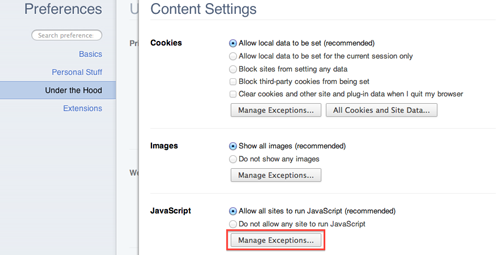
Open up the preferences, and go under the hood.

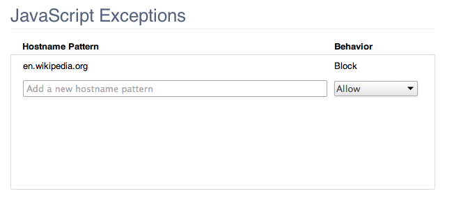
Remember when they said it was English language Wikipedia only? That’s why we use en.wikipedia.org.

Firefox

Safari

Categories
Handy Interface Technical

Homebrew: 1. Mac App Store: 0.

CLI junkies, this one’s for you.

Mac OS X doesn’t ship with an official package manager in a Unix/Linux sense. And why should it? Apple has a proven track record targeting the casual technology user ready to trade a credit card number for convenience, and this approach earns buckets of money. Thus the recent introduction of the Mac App store should come as no surprise. (And personally as a fan of ‘Internet as change agent’ I love that it will, even marginally, help reduce carbon emissions – Apple already plans to remove boxed software from its retail stores.)

Unlike in the smartphone world, software distribution for both producers and consumers on PCs/Macs has been traditionally been ‘everybody is on their own.’ On Windows there are standard 3rd party conventions, such as NSIS, and Microsoft/Apple-sanctioned ways of packaging software for distribution (.MSI and .PKG respectively). But developers/ISVs are not required to use them, and many don’t. (I’m looking at you, Adobe – your Mac installers are seriously the worst I’ve ever seen! Sometimes devs have reasonable grounds (read: limited time/resources) to employ them, but VISE and other Java-based installers I’ve encountered are unabashedly gross.)

Let’s jump away from the commercial side of computing for a moment and talk open source. Command line junkies (read: me) are into simple, lightweight solutions. We probably won’t ever use the Mac App store, preferring traditional open source package managers. We’re the folks comfortable at the command line and with modifying config files. Debian’s apt, Gentoo’s portage, FreeBSD’s ports, Red Hat’s yum are our bread and butter. The philosophies between us and the App Store’s target audience couldn’t be more different.

Speaking from the command line junkie perspective, I recently made the move from Darwin ports to homebrew. The best experience so far was the first one:

brew install git

It pulled the source and ‘just worked’ with minimal messing with my existing system.

ports, we’ll chat again when

port install git

doesn’t start weirdly compiling perl 5.8 on top of the perl 5.10 already supplied, supported by Apple, and working fine, thank you very much.

Categories
Design Interface Technical

that clover flower pinwheel command thing

Today the spotlight slides onto the history of early user interface design.

A certain Steve Jobs some time ago mentioned the history of fonts on the Mac at the Stanford Commencement 2005 speech. Rumors of Jobs’ insatiable egoism notwithstanding, he laid claim to the existence of font technology on all computers. Of course, he didn’t actually design the appearance of the fonts so much as facilitate their implementation on the Mac. The initial design work was left to Susan Kare.

Susan Kare certainly has carved out her place in the annals of user interface design. Fortunate enough to design the well-made icons for the original Macintosh, she probably contritubed more than anyone could truly foresee to the popularity of computers today. Icons were a daring metaphor in a 1980s world of “serious” text and terminals, but the risk was well worth the reward. Ask any computer user today how legitimate icon-based interfaces are and you’ll always get the same affirmation. Everyone simply likes pretty things, and even more so when they help them get things done in an intuitive way.

Kare’s font credits include Monaco and the nostalgic original iPod font (originally “Elefont“, now known as the demised Chicago) Command Key flower. Kare even worked for Microsoft too on early versions of Windows.

P.S. Mac still has a few cool quirks with its typography engine (checked up to 10.4.2). Try opening up TextEdit, switching to the Zapfino font, and typing…”Zapfino” of all things. Cool.

Categories
Design Interface

Browser Design Critic

All users are subjected to the interface designer’s choices in a very real way. If there is something that flies in the face of convention, users tend to live with it, blame themselves, or if you use a Mac, subject your blog audience to nitpicking rants.

I love experimenting with new software and seeing how developers/designers choose to implement the user side of a given feature. Apple’s well designed button layout in Safari, with the integrated progress bar-on-address-bar is pretty slick:

Furthermore, they combined the stop/reload buttons due to their boolean, opposing nature.

This particular design, incidentally, was shamelessly ripped off by Firefox, although the combined Stop/Reload button is available as a 3rd party extension.

Seeing the UI travesty that is the IE7 beta, however, yet again implies that Microsoft employees don’t actually use the software they write. Needless paradigm changes and missing features adorn their new browser. Of course, this is a beta, but for something Microsoft knew would be scrutinized with a fine toothed comb, they sure like subjecting testers to very poor usablility.

EDIT: I forgot to discuss the needless paradigm changes: if you click the rightmost tabling, it will create a new tab. Whoever thought that was a good idea…sigh. Adobe does something cool: if you double click the background of their MDI interface it brings up an open dialog. Why not make [double]clicking on whitespace create a new tab ala Firefox?